Kwiq (f.k.a King Cards)Bitcoin & Giftcards App — The UX Case Study

Welcome to the UX behind the new design of Kwiq mobile app (fka King Cards).
TIMELINE: 1 week, 2 days
MY ROLE: UI Designer & UX Researcher
PRODUCT VISION
An app that allows people to sell bitcoin and gift cards at the ease of their local currency. Including purchasing airtime and paying for other local bills.
THE PROBLEM
There are over a thousand downloadable mobile apps that trade bitcoin and gift cards but one thing most of them don’t have is the ability to trade on local currencies.
OBJECTIVES
I gave myself objectives to accomplish at the end of designing this app. Some of them were:
- Providing a new seamless design interface for users to be able to easily understand the app on the first time so that adding a new local currency wallet would not affect the users’ comprehension of how the app works.
- Making sure I add only important information so that the users understand with only a few words.
- The ability for users to search for gift cards and post pictures of their available gift cards for sell.
- The ability for users to pay for most of their online local bills within a few minutes.
- Linked wallets to banks in their local community.
DESIGN PROCESSES I USED
I personally decided to use the design process that I learnt from the IDEO’S human-centred design process to make sure I follow the correct guidelines:
- Observation
- Ideation
- Rapid Prototyping
- User feedback
- Iteration
- Implementation
TARGET AUDIENCE
- Ages 16 – 40 yrs.
- People that trade online.
MY OBSERVATION
Most of my observations came from the research I took, having Q/A sessions and interviews with people that I knew trade online and are aware of the digital and crypto world. People I know, that trade online would love a way to actually detect the price worth of the sales they make almost immediately in a value that they understand the best. Clawing and finding ways to calculate the worth of the currency of the apps that trade with dollars and pounds was rigorous as they would always turn back to their calculator.
Moreover, some people want to invest using their Naira stock exchange other than always switching to dollars/pounds.
IDEAS I CAME UP WITH
Following all the research, I came up with a few ideas.
- Having both a dollar wallet and a local currency wallet (Naira) in the app. These two wallets are independent of each other.
- Ability to create a dollar virtual card for online payments and being able to customise the card freely.
- Some other ideas came up through the user flow, that brings us to….
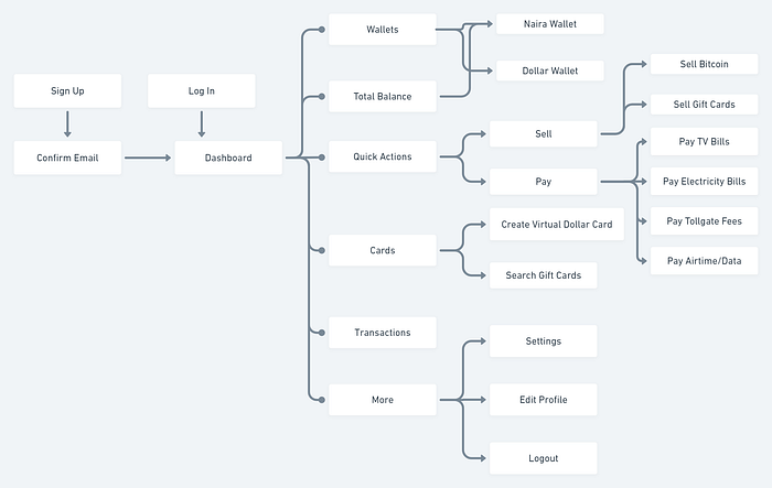
THE USER FLOW
I created a user flow to show the flow for a user who wants to actively use the app to see all the connections throughout the app.
LOW-FIDELITY WIREFRAMES
After drafting out the user flow, I entered my thought process of sketching how I would want the design screens to turn out. I did this before drafting out the design systems and style guide that the project would use. Below are some images of the sketches after a series of inspiration from numerous sources.

In this project, I did not create any high-fidelity wireframes during the course of this project for personal reasons. Most of my wireframes were lo-fi as I made sure I created efficient ones to help me.
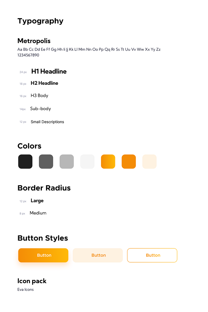
THE STYLE GUIDE
Next stop, I designed a style guide to aid the developer of the app to properly understand all the dimensions I used throughout the app. I consisted of the typography, the colours, my styles, the button styles and the icon pack incase the developer wanted to download the dependencies from the icon pack itself other than exporting the icons on the design.
Again, I tried my possible best to keep everything as simple and seamless as it could be. I even used very minimally colours.
KEY FEATURES OF THE APP
- Up to 5 Bitcoin wallet addresses
- A Naira Wallet
- A Dollar Wallet
- Sell feature: To sell Bitcoin & to sell Gift cards
- Pay feature: To pay local bills & Airtime bills
- Virtual Dollar Card

SIGNUP & LOGIN SCREENS
The signup pages were designed with the idea of having only the necessary details needed. I was mindful of a very swift and easy looking pages for users to sign up. Once a user opens the app for the first time, they would get to see a splash screen with the logo, thereafter, a login screen and subsequent signup section. For a new user, the sign-up form should be simple and user-centric. Only important information’s would be available there. After the user had signed up, the next screen would be prompt asking the user to input their bank details for payouts. Thereafter the dashboard will be the next screen. For an existing user that has logged out or re-opening the app, there would be a welcome screen, similar to the login screen, but it would just have a field for the user to input their password.
The idea behind the welcome screen was for users not to have to go through the troubles of inputting their email address and other details each time they try to log into the app. However, they would just provide their password if they were the most recent persons to use the app previously.

HOME PAGE
My thought process through the homepage or dashboard was going to be concise, I had to. I made several AB testing practices on this particular page and shared with fellow designers to act as users for me. The first problem I had on this app was that since we had three wallets on the app (the bitcoin, dollar & local currency) I had to think of the most important wallet to display on the homepage due to importance of hierarchy. After solving that with the design, the next stop was the payment buttons. What I did was to think through what the app features of payment were… (selling bitcoin, selling gift cards, paying for the airtime, paying for tv bills, paying for electricity bills etc.) everything was all cloudy in my head till I devised a means to arrange these payment features into TWO broad groups: Sell & Pay!
Finally, I designed sections for most recent transactions and a ‘sell all’ button to view the entire transactions history throughout the users' lifetime on the app. I also designed carousel sections for the promos and offers that the app would present to their users from time to time.
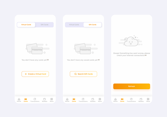
EMPTY STATES
I designed pages for empty spaces or states where needed in the app. Before a user can access the list of their available Virtual cards or their gift cards, the empty states is a form that replaces the white space that the card would contain when created. The final empty space I designed was for the app when there was a connection problem somehow. I designed a dummy ‘create card’ button that would still be in the filled area when there are more cards available. Same goes for gift cards but, gift cards need to be searched for in order to sell them. Other than the empty states, the cards menu would show a list view of all your available cards.

VIRTUAL DOLLAR CARD
I was specifically happy with the outcome of the ‘customising a virtual card screen’. After series of thinking and AB testing methods. First off, I had the data I needed for creating a card written down and it was a lot I felt a bit frustrated at first. I resolved not to take that same frsutration to the users, had to make the interface as simple as possible. I knew I needed to visually showcase the card when the user was customising it, I also knew I needed details for the user to add to their card for online payments. I sorted inspirations for online payment mobile apps like Barter , but instead of having 3 different screens for customising the card and owners’ details, I devised a means of designing it all in one screen.
However, the ‘customising a virtual card screen’ was a first time thing, and once you have virtual cards already, they’ll appear in a horizontal list view across sections with a swipable feature. Each of the cards showing the un-editable details. A click on the inputs would copy that particlar detail/information.
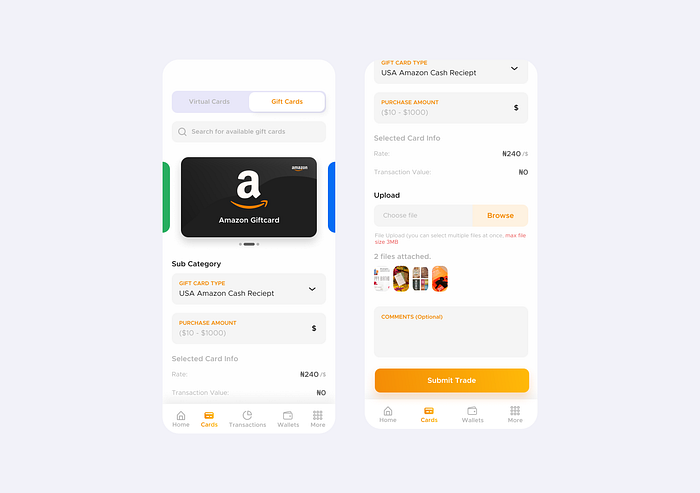
GIFT CARDS SCREEN
I did a little research on how gift cards worked before I could start thinking about how to solve the design problem of this screen. By this, I mean how to solve trading gift cards on the app. After little research done, I understood the user could be able sell gift cards by uploading a picture of the giftcard and that a user can search for available giftcards and find an initial post gift card. With this information, I drafted a search option for giftcards as well as seeing your available giftcards in a horizontal list view as well. The upload feature was designed to be able for the user to easily post pictures of their giftcards to the app and add descriptions.
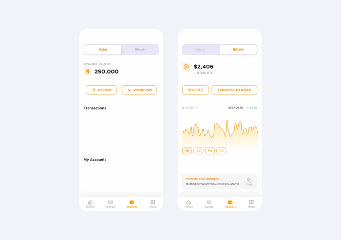
WALLETS SCREEN
It was finally time to design for the wallets of the app. One of the most important screens so it had to be straight to the point. As I mentioned earlier, I already drafted an idea of haivng two wallets for the app that store currencies in Naira and bitcoin. So, I designed two menus for the two of them. For the Naira wallet, it showcases the users entire balance and their local account information. Users can add new account numbers to use for withdrawal purposes directly to their local bank account. The bitcoin wallet is a simple wallet with only a few features, nothing complex. Just a wallet address that can copied and the Bitcoin market cap statistics.